Logo redesign
beauty salon «Beuty Flemp»
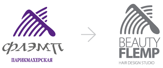
The studio was faced with the task of redesigning the logo that we developed over 15 years ago for the Flemp hair salon.
A simple, compact and readable logo retains the continuity of the old in the sign and vertical layout of the corporate block.
Continuity and recognizability of the old logo was the main task for our studio.
In connection with the ongoing rebranding of the salon, our studio needed to develop a modern logo that would speak of the status of the salon and the high level of its services.


The result of the logo redesign
Works on the redesign of the logo of the hairdressing salon «Beuty Flemp»
In the course of work on the logo of the BEAUTY FLEMP premium salon, we redesigned and improved the geometry of the brand name, which will allow it to be harmoniously combined with design elements.
For the BEAUTY FLEMP salon, we suggest using a monochrome version of the logo: black on white or white on black/purple.
The signature purple color has been changed to make it more pure, gentle and noble.

The vertical layout of the salon logo is the main one for use in corporate identity elements and printing.

Russian-language horizontal version of the logo